the Gallery
This page is for any completed works I may have over the course of this year and the accompanying commentary.
Fruit Vectors
November 17th, 2017
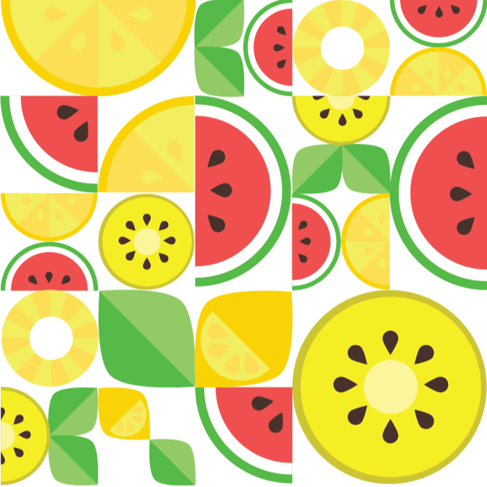
The watermelon were my favorite aspect of the design.
To make the fruit vector design, I first made a document to put the fruit vectors on. I then made each fruit piece individually.
The tools used to make the design include the selection tool, the direct selection tool, the ellipse tool, pathfinder tool, scissors tool, and the knife tool.
For the oranges/watermelons, I created two circles, one smaller than the other, and split them both in half using the pathfinder tool.
I used the knife tool to split the smaller one into individual sections that I could color individually.
The seeds were created by reshaping a circle with the direct selection tool.
For the kiwi slices, I used much the same technique as the oranges, but arranged the shapes differently. To split it in half, I used the
scissors tool to splice the pieces.
The leaves were made using a square, then rounding out two corners using the direct extension. I split it in half using the scissors tool similar to
how I split the kiwi slices.
The pineapple was made using the ellipse tool to make a circle, then using the pathfinder tool to remove the middle. The scissors tool was used
once again to add sections.
The lemon design is essentially a yellow leaf with a semicircle and prominent seeds.
All in all, my favorite fruit in this design would have to be the watermelon. The entire design is bright, but the watermelon provides a pop of vivid color that would have detracted from the design had it not been there. The red sticks out more compared to all the other colors, and so I tried to put the watermelon slices in as many places as possible.
Ironically, watermelon is far from being my favorite fruit.
Graphic Animal: Owl
November 2nd, 2017

Birds are my favorite animals, and owls are some of the best.
For my Graphic Animal project, I chose to do one of my favorite animals: the Great Horned Owl. Of all of the designs I drew, I liked this one the best because it closely matched the minimalist design I was going for. The color scheme is analogous with various shades of brown.
To make it, I mainly used the shape tool, the pen tool, and the direct selection tool.
The shape tool was used to make all of the triangles, such as the owl's crest, wings, feet, and feather pattern.
To make its body, I used the rectangle tool to make a basic shape, then used the direct selection tool to make it more of a trapezoid.
The pen tool was used to make the tree and the forest in the background.
In order to shade, I used the pen tool and drew over top of the shapes already there.
Holiday Card
Jan 25th, 2018
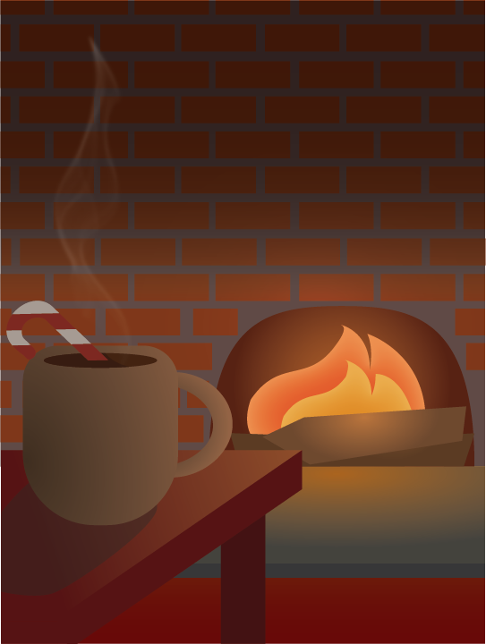
I wanted a feeling of warmth in this card.
For my holiday card, I wanted to create a warm, domestic scene.
I used gradients to shade the objects, and used inner glow for the fire.
To make the steam, I used an online tutorial which explained how to make steam using many thin white lines, and meshing them into steam-like shape.
I enjoy the look of the gradients and simple shapes.
To me, it creates a sense of harmony among the elements in the design.
This project helped me discover many different ways to use Illustrator and make shapes.
Typography Portrait
Jan 25th, 2018
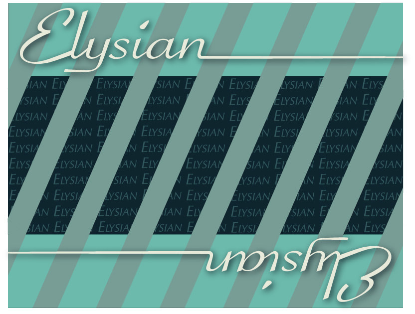
Elysian - perfect, heavenly
I chose to use the word Elysian because it stems from Greek mythology, which I am interested in. The color scheme I chose came from a palette generator called Colormind, and I chose to use an analogous one.
I made many edits to the text.
The large header and footer text were Expanded and I used the Direct Selection tool to adjust the way the font looked.
For the background text, I used a baseline shift for every column, making the text slightly uneven.
Then, I expanded the text and rotated it so it would be level but still look like it is leaning one way.
I also used drop shadows and different color modes (mainly Luminosity, I believe).
Talent Show Poster
Feb 13th, 2018
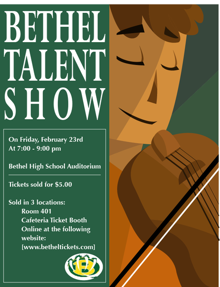
The face was a hard thing to get right.
To start things off, I had to choose a color scheme. The color scheme I chose was almost complimentary, using greens and oranges.
The tools that I used include the shape tools, pen tool, and knife tool.
The pen tool was used to make most of the shapes, and the knife tool was used to cut the shapes so shading could be applied.
I also used the line tool to make the violin strings.
The two font families I used are Perpetua for the title, and Optima for all of the other text.
My biggest worry is that the violin is inaccurate, even though I did use references.
Magazine Cover
Mar 21st, 2018
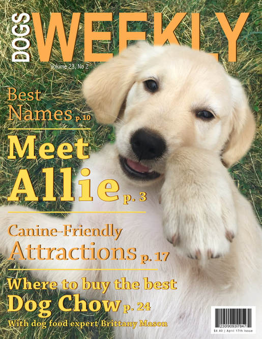
Brittany Mason may or may not actually exist.
To begin the cover, I first adjusted separated Allie from the background using the layer mask.
After this, I boosted the colors on her image.
Since the photo was taken with a blueish lighting, I added a layer with a yellowish brown color to add vibrance.
On the text, I used layer styles to add drop shadows, and sometimes added strokes.
To make the barcode, I made a brush ! x 100 px and adjusted the scatter settings on it.
I put the masthead layer in between Allie and the background layer to put her head over the masthead.
The fonts I used are Abadi Condensed, Arial Narrow, and Chaparral (Bold and Normal).
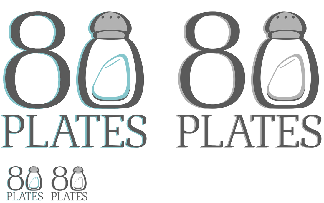
Logo Project
Apr 19th, 2018
|
I wanted to make a logo for a restaurant that could appeal to families and young adults. With that in mind, I tried to pick fitting fonts and colors, and I think I did decently.
I first used the text tool to add the 8 and PLATES. For the salt shaker, I used the shape tools and direct selection tool to adjust the shapes. After the basic construction was done, I added drop shadows to the text and salt shaker for a feeling of uniformity. |
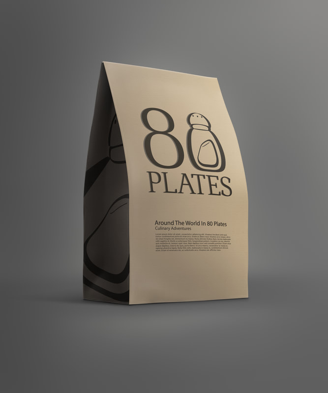
Mockup
Apr 27th, 2018
|
For my mockup I decided to go with a paper bag, as if somebody was getting a snack or something similar form the restaurant. Originally I wanted the side salt shaker image to be the color of the bag, but I couldn't figure out how to save it properly after that and so left it as is.
In order to make the mockup logo on the front, I took a copy of the original logo and turned it into grayscale. Then, I added it to the file and used the layer mode Darken. I did a similar thing for the side, except I only used the salt shaker. |
|
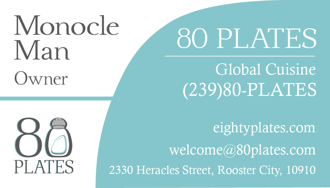
Business Card
May 3rd, 2018
|
For my business card I wanted to do a simple and modern design, and therefore used simple shapes and lines. To keep the colors consistent, I used the colors present in the original logo. I used a few serif fonts for all of the text. My main regret is that because I used a custom font, the business card printed funny and the spacing of "80 Plates" was messed up. It also, oddly, became a sans serif font on the printed version.
|
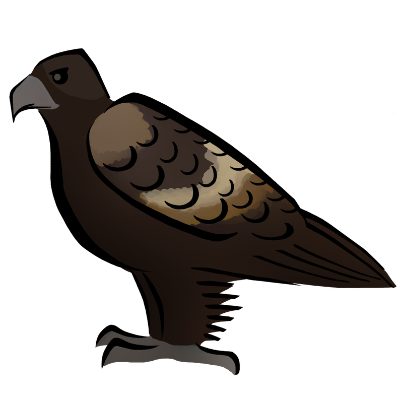
Zoo Graphic
May 17th, 2018
|
Our theme was Australian Outback, and I wanted to do a bird for my animal. Looking through birds, I decided that my favorite was the Wedge Tailed Eagle. As we worked together, we decided to use line as our theme. I was told to use either Illustrator or Photoshop (as long as I downloaded it as a .png) and I chose Photoshop. I made the lines and colors on different layers using the brush and eraser tools. To keep with the line theme, I tried to keep the lines as free flowing as possible. The shading was originally more complex, but I tried to simplify it to make it resemble the other design' coloring. The blur tool was helpful in doing this.
|
|
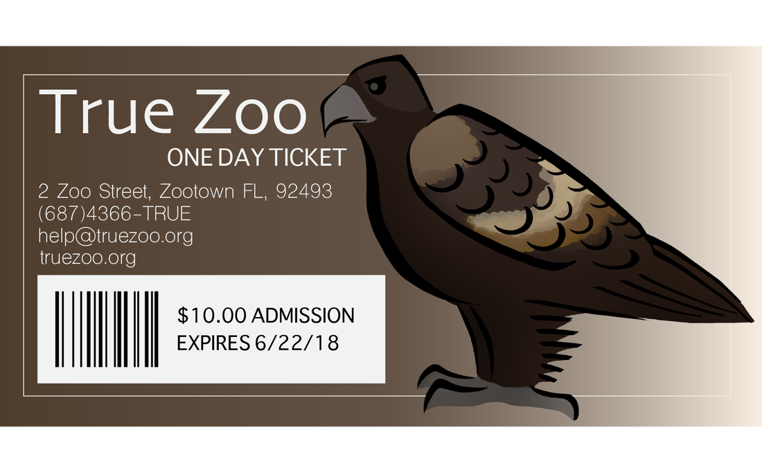
Zoo Ticket
May 17th, 2018
|
I chose to make a ticket, and I first looked up zoo tickets to use as reference. I found that most of them were fairly plain, but some used a gradient design. I liked the idea of the gradient design, so I used the dropper to get a brown color from my bird to use. The barcode was made using rectangles put next to each other. In the end, I also added a box around the ticket since it seemed too plain.
|
